Andy Warhol added to the popularity of the image of Campbell’s soup when he began painting the cans in 1962. Certainly it was innovative to use an everyday object as the focus of artwork, and I think Warhol deserves the kudos he received for this irreverent innovation that shocked the art world at the time. At a recent MOMA exhibit, the colours and images of the soup cans were used as an iconic touchstone for Warhol’s work.

Seeing the Warhol exhibit at MOMA, I began to wonder about the appeal of this image that has become almost as pervasive as Coca-Cola. (Note that both these products use an iconic cursive script that evokes an old-timey, homey feeling. Shockingly, today’s British Columbian schools no longer even teach handwriting! It is indeed becoming a thing of the past.) Campbell’s soup is on every store’s shelf in North America, from the biggest supermarket chains to the smallest out-of-the-way bodega in Big Sur! According to Campbell’s US website, Campbell’s tomato soup, chicken noodle soup, and cream of mushroom soup are each numbered in the top 10 “shelf-stable” food items sold in US grocery stores today.

So who deserves the credit for creating a package design with such universal appeal? I think it’s the commercial designer who designed the Campbell’s soup can in 1898, when a company executive, Herberton L. Williams, attended a Cornell-Penn football game and was impressed with Cornell’s brilliant new red-and-white uniforms. According to The New York Times, when asked the question of who designed the label, the company spokesperson said it was a joint effort, with different elements contributed by different people over the years. For example, the Campbell’s script was based on Campbell’s own signature. In 1900 they added the gold medallion that Campbell’s won at the Paris world exposition.
The basic label has changed very little since then. I just saw a Campbell’s tomato soup can in Big Sur that looks exactly the same as the can in my toy kitchen in 1970. (The 20 billionth can of tomato soup was produced in January 1990.)
Sure, there are some new twists to the packaging, like the can I photographed in my Mushroom Soup series, which boasts Vitamin D and real cream. There is a cream of potato soup that says it’s made with “fresh Canadian potatoes” too. So Campbell’s is trying to keep us hooked as we become more health conscious, and has different packaging for Canada and the US. They redesigned the label in 2010, retaining the red and white elements but adding a swirl around the mid-section. However, the top three flavours mentioned previously retain the classic label.

Sadly, my tastes have moved away from canned soup altogether. But when I see a can of Campbell’s soup, it tugs at my heart. The positive associations of many childhood lunches of Campbell’s tomato soup with grilled cheese sandwiches–this totally defined comfort food for me. And what about putting that cream of mushroom soup into a macaroni and cheese casserole. Brilliant! Or using it as a topping for porkchops. I do harbor a secret wish for these delights from a simpler millenium.
On the other hand, I had a boyfriend once whose culinary crowning glory was a mixture of unheated, undiluted Campbell’s mushroom soup mixed with tuna on toast. Yes, it was as gross as it sounds. Even Campbell’s soup can be used for good or evil!
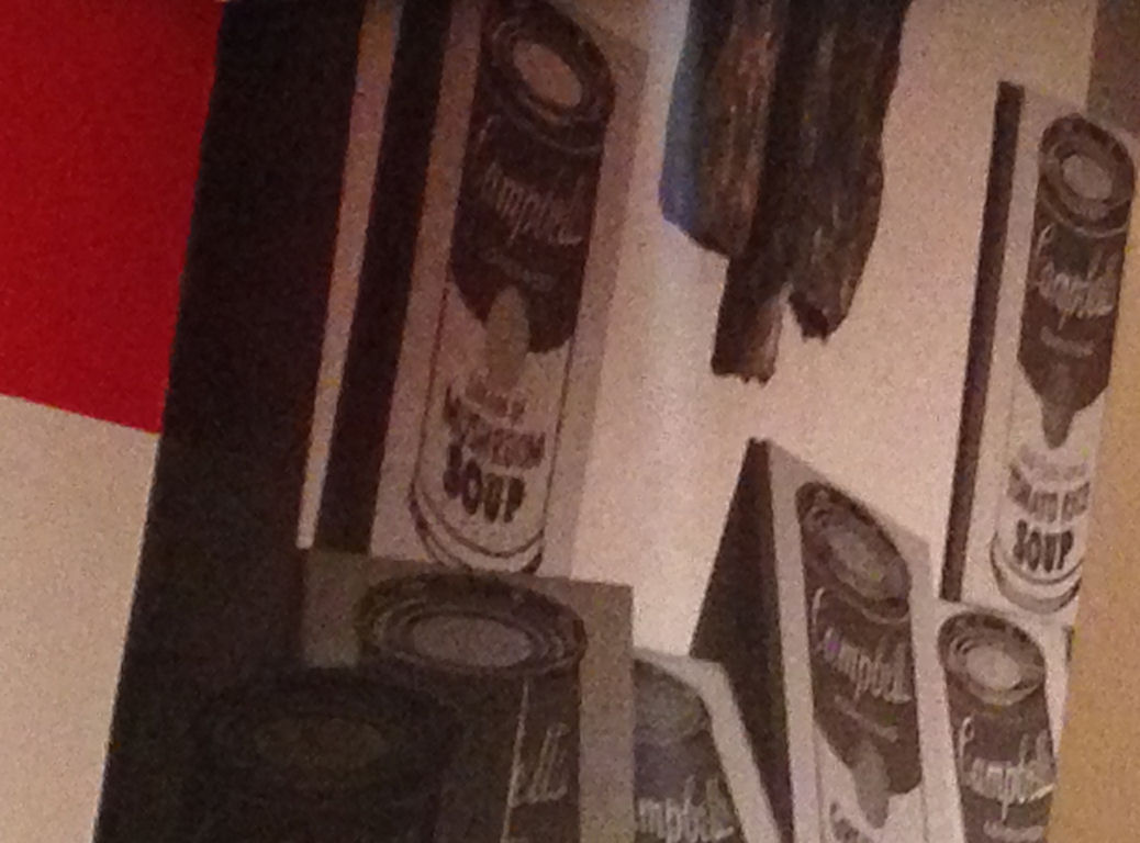
 The story of Campbell Soup began more than 140 years ago, in 1869, when Joseph Campbell, a fruit merchant, and Abraham Anderson, an icebox maker, formed the Joseph Campbell Preserve Company in Camden, New Jersey producing and selling canned fruits and vegetable preserves. It wasn’t until 1897 that the concept of condensed soup was born, due to the genius of the then 24-year-old Dr. John T. Dorrance—a nephew of the company’s general manager, and a chemist—who invented condensed soup. (Think what an impact this invention has had on our world!) Dorrance later became president of the company from 1914 to 1930. The original label looked like the ones shown above.
I think one of the reasons we love the Campbell’s soup design is that is it something that remains unchanged. It evokes our nostalgia, our longing for a simpler time, for childhood pleasures. It is an archetypal image in our collective unconscious, and this is what it symbolizes for us.
For me, when I saw a stack of Campbell’s soup cans in Val and Garry’s cupboard, it sent me on a two-day romp through the forest hiding cans for when they returned, and it led to an explosion of artistic inspiration. I hear that several Chelsea galleries in Manhattan also recently featured artists whose work included Campbell’s soup cans. So it’s not just me that still goes crazy for these red-and-white darlings!
If you’re interested in reading more about the history of Campbell’s soup, check out this Canadian site and this UK site.